

Search engine optimization rankings depend heavily on mobile optimization because Google grants better positions to websites that deliver a friendly mobile experience. Businesses need to optimize their websites for mobile devices to sustain competitive search rankings since Google uses mobile-first indexing and user-centric features demand fast loading times and responsive design. The article examines the essential components of mobile optimization and SEO implications while providing future-oriented best practices for improving mobile performance and user engagement.
The Rising Necessity of Mobile-Friendly Websites
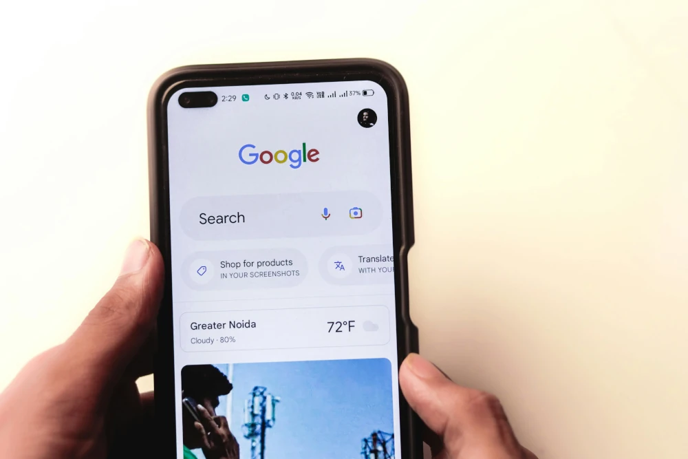
Have you ever tried to load a site on your mobile phone and it looks like it was made again for 2005, with buttons you can’t tap and text that is so small you need a magnifying glass to see it? For sure, we all have quit some websites in rage.
This is the thing: Google hates this experience, no less than you do. In fact, if your website is not optimized for mobile, you more or less tell search engines, “Please, rank me low.”
We will take you into the maze of mobile optimization without boring technical terms and confusing abbreviations. You will learn why it should matter, how it would affect your SEO, what you can do with it, to make Google (and your users) love your site again.
The Role of Mobile Optimization in Improving UX
Designing a website interface for optimal user experience on smartphone and tablet devices. This means adjusting the layout, images, buttons, and content to operate perfectly on all small screens.
Why does it matter? Because:
- Google prioritizes mobile usability in its ranking algorithm.
- Mobile users bounce quickly from sites that are hard to navigate.
- Conversion rates drop when your mobile experience lags
In simple words, if a website is not functioning well with a mobile phone, it will not rank well.
How Mobile Optimization Impacts SEO Rankings
Mobile performance is one of the criteria now considered by Google as a top-ranking factor. This is how it is related to SEO:
1) Mobile-first indexing: Google here considers the mobile version of your site when determining search rankings.
2) Bounce rate-reducing: A favorable mobile experience keeps users on your site longer.
3) Improved core web vitals: Faster, more stable pages get rewarded in search.
4) User signals: Happy user = positive engagement metrics = higher rankings.
Hence, direct prompt by such parameters is your mobile performance.
Key Elements of a Mobile-Friendly Website
Now, let’s look at what we think are critical elements in optimizing the mobile site:
Responsive Design
Responsive design dictates that the website should automatically resize to suit any screen size. This keeps away the highly undesirable pinch-and-zoom and maintains content readability across devices.
Pro Tip: Use media queries in CSS to create a variety of layouts for different screen widths.
Fast Loading Speed
Speed is king. The mobile user wants to access you instantly. Once they have to wait more than three seconds, they’re gone.
PageSpeed Insights and similar tools will tell you where you are lacking in speed and help you rectify it.
Mobile-Friendly Navigation
Streamlined menus, collapsible accordions, and sticky nav bars are invaluable tools for making websites usability-friendly on smaller devices.
For example, render desktop mega-menus useless: use “hamburger” icons or slide-out panels instead.
Readable Text and Tap Targets
Fonts need to be readable with no zoom required, while buttons need to be big enough to tap with a finger.
16px-and-up font size and 48×48 pixels tap area should be your aim.
Google’s Mobile-First Indexing Explained
By default, Google has begun to live with mobile-first indexing. This means that they crawl the mobile version first and then the desktop version for the comparisons.
An incomplete mobile site, slow to load, or poorly designed will hurt your rankings all over the place, including desktop search.
Key takeaway: Your mobile site is not a backup; it is also the primary version that Google cares about.
Mobile SEO Best Practices for 2025
Staying updated with the best practices keeps you ahead of your competition. Here is what to focus on in 2025:
For regional businesses, partnering with Cardiff SEO experts ensures strategies that are aligned with the latest mobile SEO trends and local market demands.
Use of Core Web Vitals
Core Web Vitals measure real-world user experience in three key areas:
- LCP (Largest Contentful Paint): Load speed
- FID (First Input Delay): Interactivity
- CLS (Cumulative Layout Shift): Visual stability
Google rewards those sites that fulfill the criteria on all three. Utilize Google Search Console to check your score.
Optimizing Images for Mobile
Images are heavy and thus slow down the speed of mobile devices. Resize your pictures first, then save them in modern formats like WebP. TinyPNG or Squoosh can be useful for reducing the size of a photo.
Using AMP
An AMP (accelerated mobile page) is a framework that Google supports so that pages load instantaneously on mobile devices. It’s not directly a ranking factor; however, since AMP pages have often been created in top stories, this will have a great positive impact on user experience.
Use AMP on blogs, news, and other heavy, complex sites that are speed-critical.
Common Mobile Optimization Mistakes to Avoid
Avoiding these common pitfalls can save you from ranking drops:
- Blocking important resources like JavaScript or CSS on mobile
- Unplayable videos or Flash elements
- Intrusive pop-ups that disrupt user flow
- Thin or missing content on mobile versions
To avoid these mobile missteps, businesses often turn to specialised Portsmouth SEO services for expert audits and fixes that boost performance.
Always test your mobile site thoroughly to ensure consistent functionality.
Tools to Test and Improve Your Mobile Site
Here are some expert-approved tools to keep your mobile site in top shape:
| Google Mobile-Friendly Test | Evaluates mobile usability | Try it here |
|---|---|---|
| PageSpeed Insights | Analyzes speed and performance | Visit now |
| GTmetrix | Detailed performance reports | Use GTmetrix |
| Screaming Frog SEO Spider | Mobile site crawling and error checks | Learn more |
These tools provide actionable insights, from load times to tap target issues.
Brands That Boosted Rankings with Mobile Optimization
With mobile optimization serving as a benefactor, let’s see how companies improved their SEO:
1. Zalando
Zalando revamped its mobile website, increasing the speed of load times and adjusting for responsive layouts. This resulted in an increase of organic traffic by 35 percent.
2. BBC
The BBC news incorporated AMP and streamlined its mobile aesthetics for faster breaking news delivery, along with increased mobile engagement.
3. Domino’s Pizza
One-click ordering was introduced on Domino’s new and improved mobile site, resulting in greater-than-sixty percent conversion rates.
These instances demonstrate that good mobile UX translates into measurable SEO impact and business profits.
Final Thoughts: Why Mobile Optimization Is No Longer Optional
Mobile optimization is no longer purely about user experience; in fact, it has become an integrative pillar of modern SEO. A mobile-unfriendly website would damage your search visibility with mobile-first indexing, Core Web Vitals, and even change user expectations.
FAQs
What is the importance of mobile-friendliness in SEO?
As all-important for SEO, mobile-friendliness is because Google ranks sites optimized for mobile higher than others in the search results, so that users can have the best experience when visiting such sites.
What is Mobile User Experience in SEO?
Mobile user experience in SEO is that users find it easy and effective to visit and use the website from mobile devices.
What increases SEO ranking?
High-quality content, mobile optimization, fast loading speed, user experience, and strong backlinks all increase SEO ranking.